Music Takes Form in Sublime Visuals with Samuel Burgess-Johnson’s Art
Known for being a regular collaborator of musicians, art director and designer, SAMUEL BURGESS-JOHNSON perfectly captures the atmosphere of the sonic pieces he translates into fine art.
The London-based creative has names like The 1975, James Vincent McMorrow, Zedd, Tove Lo, and 30 Seconds to Mars among a slew of other remarkable figures in his range of clients and he only continues to transform sound into a visual feast alongside a string of other masteries in his arsenal. Growing up in the serene landscape of Norfolk, which Sam describes as “a beautiful and calm part of the world”, no real scene or great pressures existed. This became an ideal place to identify and develop ambitions past any social or financial burden for Samuel who initially tried his hand at music and clothing design before getting into the craft he’s immersed in at present. “I used to make awful music and was certainly more into making the artwork look pretty than learning how to make music. I then started a clothing line called Forty Ounce. I would send clothing to musicians I thought were cool in exchange for promo,” he shares. With these efforts, he eventually developed relationships and a network in the music industry, with Matty Healy from The 1975 being the first person to tap him to design artwork for his then band, BIGSLEEP.
“Good design or identity is vital for a musician. Putting the actual music to one side, you can make any musician seem cool if they are framed within good aesthetics”
Ultimately leaving that realm, Samuel decided to focus on more art-oriented pursuits, retaining his accord with Matty, who he now frequently creates with—from The 1975’s merchandise to their dreamy show visuals—and aimed his attention to work in music and occasional advertising stints. From his innate penchant for music, this became a catalyst for his ability of easily interpreting and integrating melodic fragments with visual art and an aspect he considers fundamental to a musician’s work. “Good design or identity is vital for a musician. Putting the actual music to one side, you can make any musician seem cool if they are framed within good aesthetics,” Samuel expresses.
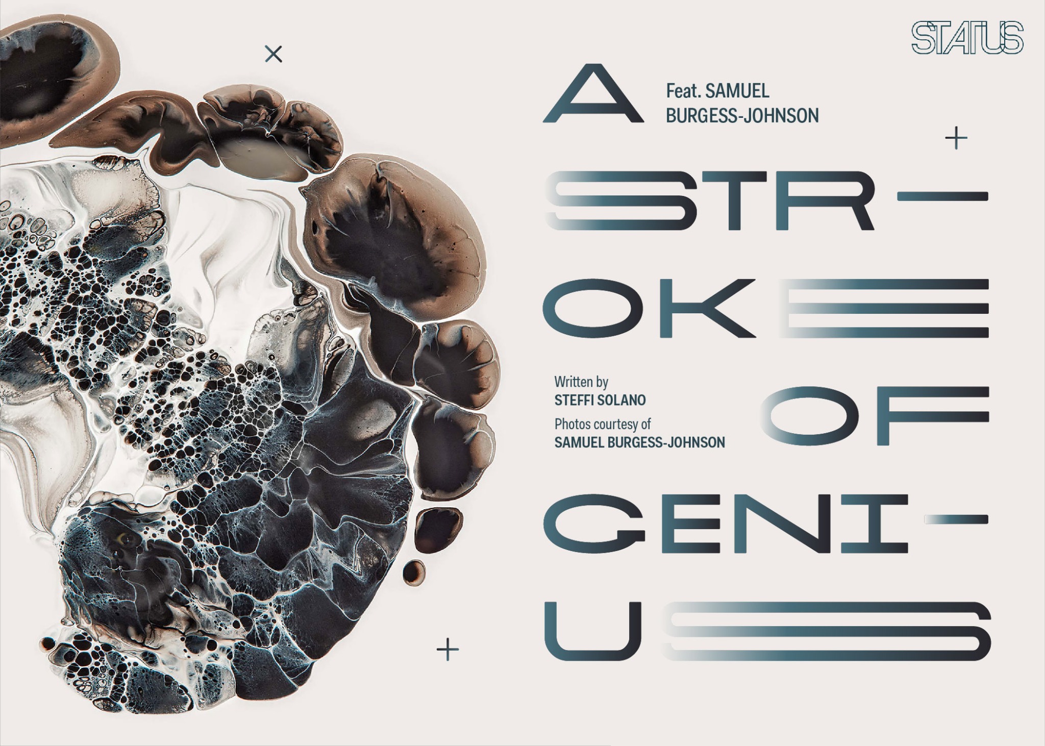
 Apart from graphic design, he’s also a painter, illustrator, and photographer—dipping into the slow burn, experimental process of fluid art, ruminative of his state of mind as well as capturing dynamic floral images reminiscent of 17th-century Dutch paintings. Samuel doesn’t confine himself to a category, nor is it easy to define his style; he’ll veer into traditional art and then experiment with installation the next—an approach he ventured into for one of his most beloved projects to this day; The 1975’s I Like It When You Sleep promotional campaign featuring neon signs shot in various locations across the globe in a collaboration with photographer, David Drake.
 “The hardest part is just starting something. Once you get going, the ideas will come.”
Within such a challenging craft and industry, despite exhibiting such refined and solid artistic panache, Samuel is honest in saying that he’s no stranger to getting stuck when jumping into a new scheme of work. “The hardest part is just starting something. Once you get going, the ideas will come.” He adds, “The ancient Greeks believed you were visited by inspiration muses, so it helps to be at the computer ready for their visit. It's just about turning up everyday and getting on with it. Being self-employed means a lot of self-motivating.”
Taking a break from his regular brainstorming and artistic experimentation, Samuel gets real as he sets his tools down to speak to us on his insights about music, design, and the realities of a career in art.
More than design, you also do photography and work on campaigns. Can you describe a regular day in your life? What keeps you busy?
I would say an average day would be developing ideas and general design work in front of my computer or on location for a shoot. I am the creative director for the record label, Dirty Hit and across the art on pretty much all of their releases, this keeps me very busy. On top of that, I usually have some other campaigns for various record labels and advertisers. When I don't have any client work, I like to experiment with paint, typography and general image-making. Outside of that, I like to walk my dog (a Bullmastiff cross named Allen) and work on my car (BMW E28 named Paula).
Your work with The 1975 is incredibly fascinating. What is the process like collaborating with them on their visuals? How does their music and your art blend and come together?
I love working with The 1975 because Matty and everyone at Dirty Hit Records and myself work so well together. We all understand how each other work and how good ideas are developed, not forced. Both our careers started at the same time and we are so intertwined at this point.
What has been your most favorite project so far?
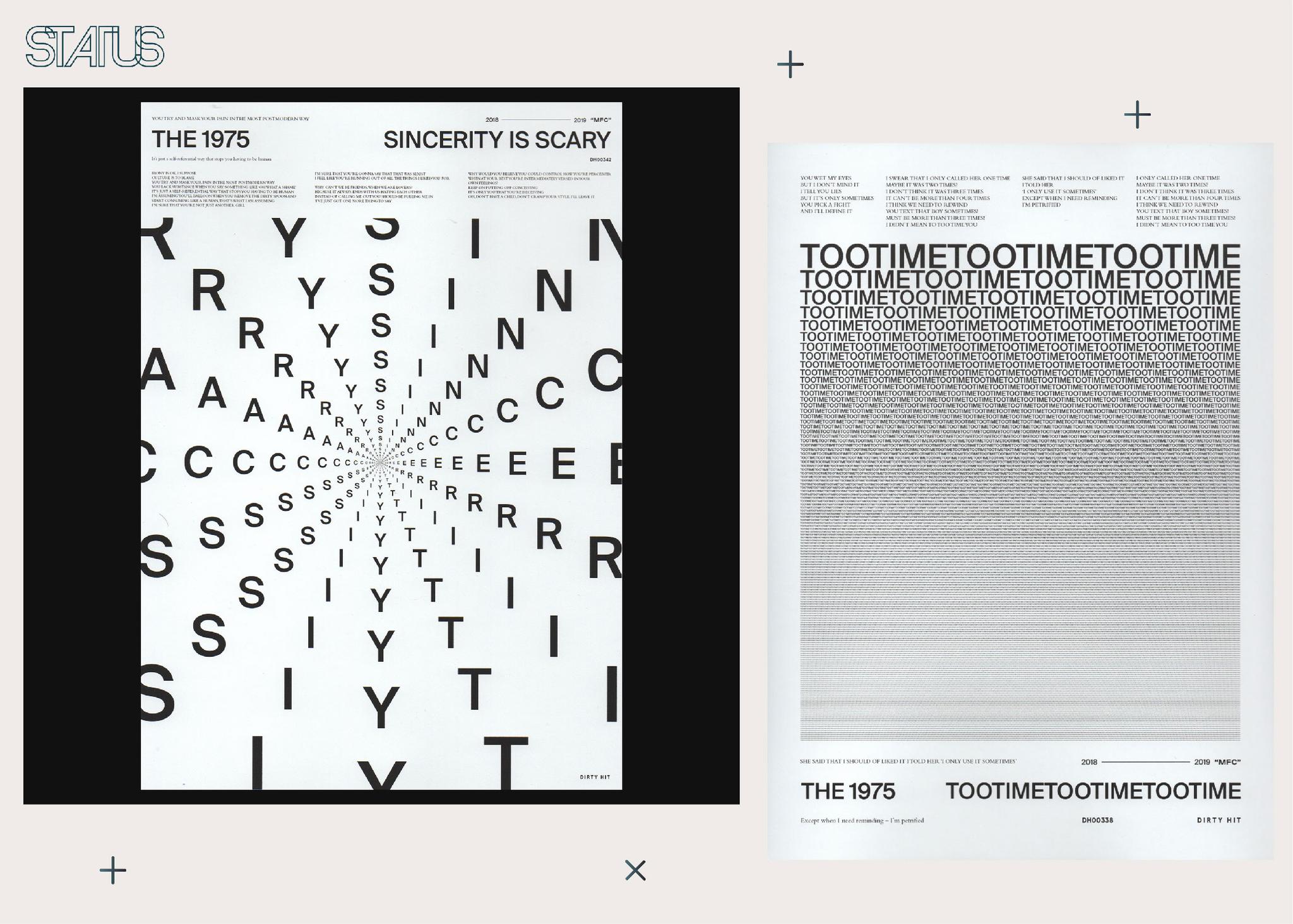
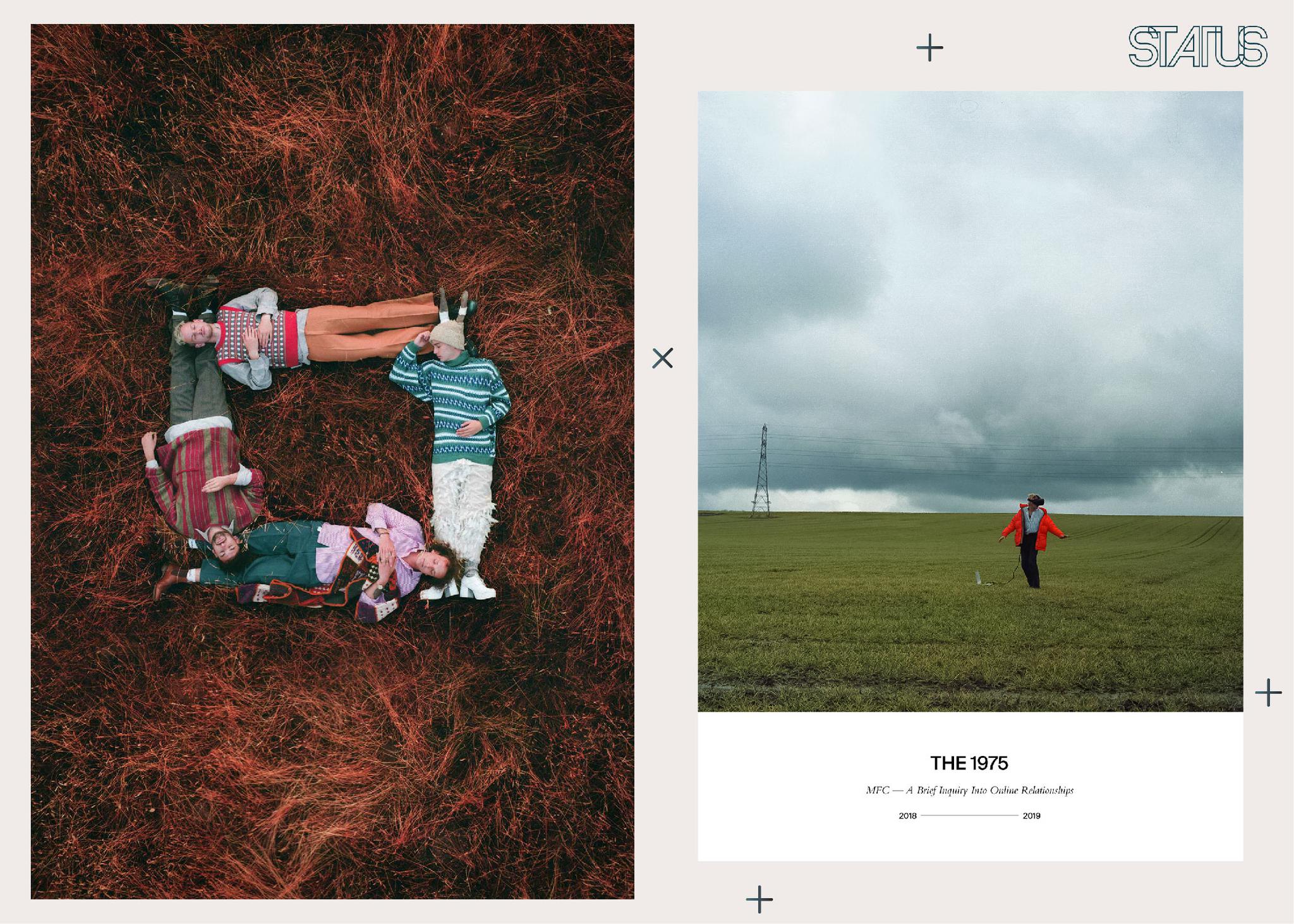
My current campaign for The 1975’s A Brief Inquiry Into Online Relationships has seen some of my best work be produced. Still a lot more to come from that. I have also been working on a massive project for a top secret skincare range for a very large company. That has involved painting and has been a really fun one and I'll be able to show it soon hopefully.
Your neon series for their previous record is a project beloved by many to this day. What was it like trying to capture the mood and atmosphere through photographs? How did you decide on each location?
A stressful and an amazing experience. Carting extremely fragile and expensive neon signs around the world was an amazing headache to have. Each location was decided by Matty and myself in reference to each song on the album. Some happened with spontaneity and some were meticulously planned out. There was also a lot of post work involved to create an atmosphere where needed.
How can you say that a work is done? From the perspective of a creative all-rounder, what makes a good artwork?
[For] the last five years, it's felt like I never have enough time to really, completely flesh out a single project; the industry is so fast and deadlines are always yesterday. An artwork is usually done after you have sent 50 mock-ups and the client has disagreed with all of your basic design moralities. Good artwork is always the first design I present, it is then picked apart by the client, you just have to hope not too much.
You’re also into fluid art. With its trial-and-error process, how do you decide that a piece is finished? Do they have various meanings to you or do you choose not to define them at all?
Up until my recent skincare project in which the paintings have been commercialized, they have always been a therapeutic pursuit carried out by myself at about 2 AM when I'm feeling a bit depressed and weird, so for me, they do have a lot of purpose. But it’s very insular and not really something that is purveying a coherent message to an audience.
Which is more important—your message or the audience’s perception of your art?
I don't think I'm really in control of either. The message is always filtered through the audience's own experiences. I care a lot about what people think of my art, that means everything to me.
Finally, what are your future plans? What else can we expect to see from you?
I am moving to Los Angeles next month which is really exciting and I am using it as a clean slate. I will continue working with my closer clients but I also see it as an opportunity to explore new avenues, though I don't know what yet.
Written by Steffi Solano
Photos courtesy of Samuel Burgess-Johnson
Special thanks to Form Artists
Post a comment